Do you want a larger audience to consume your social media content? Wondering how to create content that’s more accessible to people with impairments?
In this article, you’ll discover tips and tools to make your social media content accessible to everyone.
![]()
Why Accessibility Matters to Marketers
A lot of people assume that accessibility is impossibly specialized and not for them—the developers will take care of it, the social networks will take care of it, or people with accessibility needs will figure something out on their own. But that’s not the case.
Accessibility online is a complex patchwork of website design, browser features, accessibility tools, and yes, the ways that individual users share content. You can make a difference in terms of accessibility by applying just a few rules and tools to your social media content.
To put it another way, if you aren’t using these rules and tools, you’re shutting out a very large number of people from your brand. According to the UK government, at least one in five people has a disability, impairment, or long-term disability. That’s 20% of your potential audience right there. You can’t afford—ethically or in business terms—to neglect accessibility online.
We have been offering accessibility upgrades for a number of years. Let us show you how inexpensive it is to have a simple option (look for the Accessibility icon to the right) that allows visitors who are impaired to access your site with a much more fulfilling experience. Learn more here.
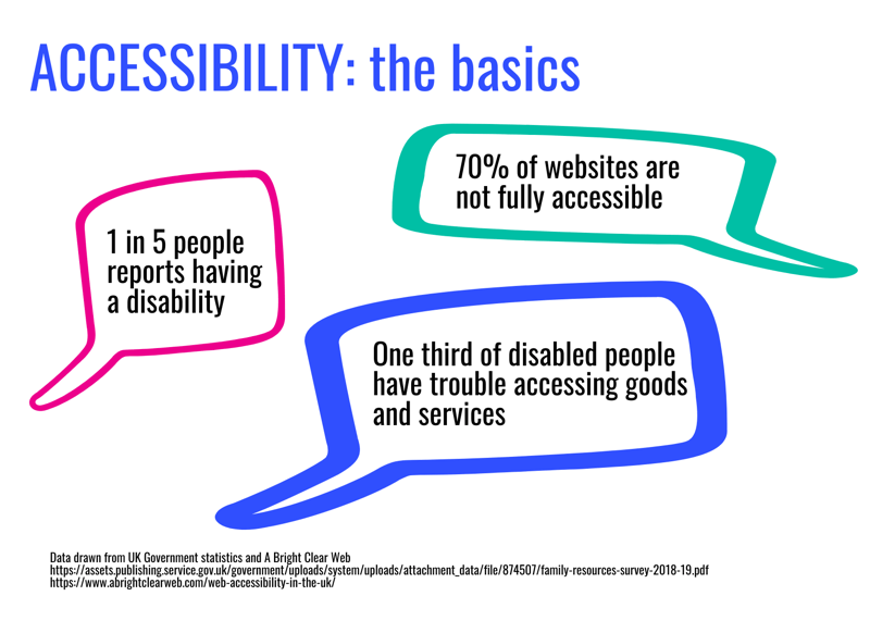
The good news is that on social media, some of the work is already done for you. Platforms like LinkedIn, Facebook, and Twitter have begun to introduce more accessibility features to provide easier access to text, images, and video. While you’re on those platforms, you don’t have to worry about developer details like whether the page navigation is marked up correctly.
Here’s what you do have to worry about: The media and design of your content also affect accessibility, sometimes in quite unexpected ways. If you’ve never had to think about accessibility before, you may be missing some very easy fixes. In the sections below, I’ve outlined some basic tips and tools for posting accessible text, images, video, and links on social media.
Note: This advice is designed to make your social media content more accessible. It won’t be perfectly accessible because social networks are still not perfect and it’s difficult to anticipate every accessibility issue that someone might have. But this is a good place to start.
#1: Make Text Accessible
Today, we tend to think of social media as pictures and videos but it all started with text. Here are a few ways you might be sharing text on social media:
- Facebook page updates
- Tweets
- Text in Instagram or Facebook Stories
- LinkedIn posts
- LinkedIn articles
- Comments on Facebook or Instagram posts
- Twitter replies
- Direct messages
- Social ads
- Profile bios
Every time you share a piece of writing online, you need to think about its accessibility in two ways. First, is the text visually accessible? And second, is it easy to read? With our Website Accessibility Access, you can easily check how your publication will look to those with disabilities.
Let’s start with the first point. When I say “visually accessible,” I mean, quite literally, can people see it? It’s more difficult to read text that’s in an unusual font, very small, or in a color too close to the background color.
Here’s a quick pop quiz: Spot the issue with each one of these Instagram stories I’ve drafted.
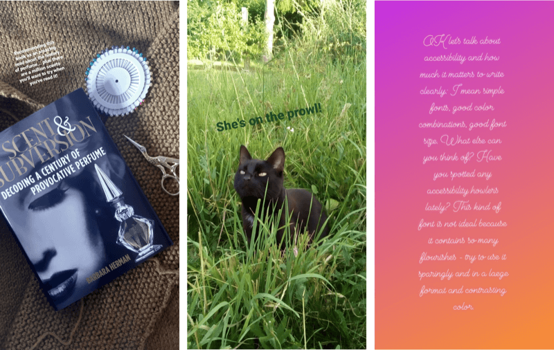
There’s a reason that most social networks use a sans-serif font by default. They’re usually easier to read. If you want to use non-standard fonts or characters, you have to copy and paste text from a converter, like this one.
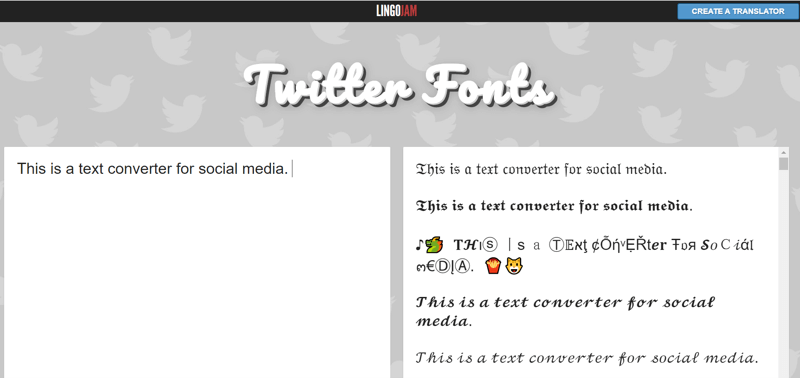
Neat, huh? Unfortunately, this is horrible from an accessibility point of view. The converted text is already less clear than a standard sans-serif font. But it gets worse. In some fonts, the converted words are no longer words. Instead, each letter has been converted into a Unicode symbol.
To illustrate, the first letter of the converted text—that beautiful Gothic capital “T”—is called a Mathematical Fraktur Capital T in Unicode. And to a screen reader, it’s not a “T.” It’s symbol “U+1D517.”
So if you use a screen reader, you won’t hear the phrase, “This is a text converter for social media.” You’ll hear “U+1D517 U+1D515 U+1D526 U+1D530…” Well, you get the idea.
Most screen readers also struggle with emojis, non-standard characters, and some punctuation such as ampersands. Just like the fancy Gothic text in the example above, they’ll either read out the Unicode for each character or skip it altogether.
Of course, you can still use emojis (they’re fun!). Just make sure that you don’t use them to replace key words. To visualize this, this tweet is okay:

You might also notice that I’ve only used each emoji once. I did that so screen reader users don’t have to hear the same Unicode read out three times in a row.
This next tweet—however nice it sounds—is a disaster. Anyone using a screen reader will have to fill in the blanks for themselves, with possibly questionable results.

Finally, don’t lose sight of that most basic rule of copyrighting: Keep it simple. Short text posts can actually be harder to write than long articles because you have to pack so much into just a few characters. Avoid ten-dollar words, unnecessarily complicated grammar, and idioms or in-jokes that might be hard to understand. Clever writing can be fun for the writer but it’s not always a great experience for the reader.
Is your website ADA compliant? Learn here.
#2: Make Images Accessible
We’re always being told that social media is visual. Most of its content, interaction, and appeal revolve around photos, infographics, images, and memes. However, if you’re a person who can’t see, or can’t see very well, this isn’t ideal.
Whenever you share an image on social media, you should make sure that:
- It’s easy to see and understand.
- There’s an alternative medium for people who can’t see the image.
Let’s start with “easy to see.” Most of this is common sense. Any photos you share should be well-lit, from a clear angle, and without too much background noise. If you share illustrations, computer-generated images, or edited images, you’ll also need to think about color palettes and combinations.
My absolute favorite tool for this is a free website called Who Can Use. You can plug in the hex numbers for any color combination and the site will show you how it looks to people with different visual impairments. It also gives you the percentage of the population for each impairment. You may be surprised by how many people don’t have 20/20 Technicolor vision.
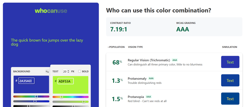
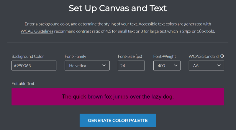
Another helpful tool is Color Safe. This is another free app with a similar approach. You tell the app your background color, font size, and a few other design details and it suggests accessible color combinations.
Next, let’s talk about alternative media. If someone can’t view an image, they should be able to access the information it holds in another way. This is why we have alt text.
You can now add alt text to images on Twitter, LinkedIn, Facebook, and Instagram. (LinkedIn and Facebook even have tools that automatically generate alt text if you forget but writing it yourself is preferable.)







Leave A Comment
You must be logged in to post a comment.